C.I.A Censorship Interactive Article

An interactive article that brings up the topic of the C.I.A and why they censor information.
frame 1 (3)
My work on this project was on the visual and interactive part of the design. My partner Joseph Cyrus did all of the written content. My goal for this design was to make the interaction interesting but keep the visual design professional and government official. Joseph did all the interviews for his content and information. For my research for the design I asked Joseph what he wanted to see in the design and for the interaction elements.

My Role(s): UX Researcher, UI Designer, Wireframing, Prototyping, etc.
The Team: Allesandra Raithel (Ux Designer), Joseph Cyrus (Journalist)
Project Duration: February 2024 - May 2024
Tools Used: Figma
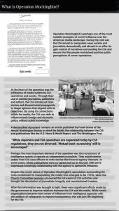
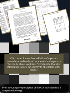
The Impact: In this interactive article Joseph Cryus talks about how the CIA censoring important information keeps people in the unknown and provides finding of people who have tried to bring their evidence on the CIA to the public.

Competitive Analysis:
The CIA News and Stories provides the information that can be open to the public. It has a nice layout and has good graphics. The interactive part of this website is also pleasing for users. This site has information straight from the CIA which is what our article is about.
The New York Times is a reliable source for information. This site provides helpful and informative resources as well as good graphics. Something this site lacks is the interactive portion to their articles. Our article isn’t a website but it provides necessary information and has a design to back it up.

screenshot 2025 11 20 at 10.37.14 pm 1
After the article was brought to my attention for needing a design, I had to think of what direction I was going to take with the design and interactions. My thought process was how do I make this fun but also keep it looking government official visually. I came up with my ideas after some sketching and wireframing.
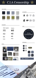
For the colors I chose, I decided to go with military or government official colors. I didn’t want any bright colors that would stick out. I wanted to keep the overall design to still represent an article. For my font, I chose a serif font for the title and headers but a sans serif font for the body text. For the imagery I went with different pictures of articles, censorship, coding, etc.
363 moodboard (3)
screenshot 2025 11 20 at 10.37.22 pm 1
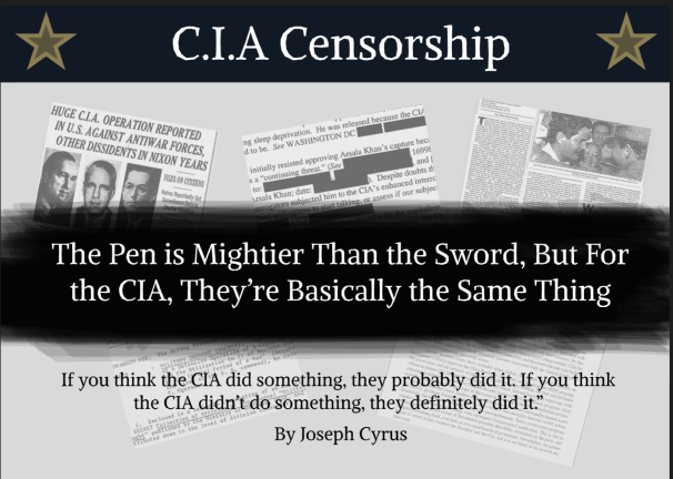
My final design showcases an interesting but official style and interaction. Viewers can have something interesting to read while enjoying the overall look and feel of the article. If I took more time to work on this design I would add more to the interaction. I would also make the layout of the design more spacious and easier on viewers' eyes.
Contact

Contact me to discuss your design needs. Let’s bring your ideas to life!