Caterpillar Rental Store Prototype

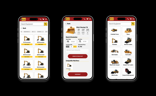
A redesign of Caterpillar's Rental Store Website in mobile view that simplifies the renter process for users.
frame 1 (3)

The Cat Rental Store website lacked a simple way for customers to rent attachments for their equipment. This leads to compatibility issues and incomplete rental orders. Some customers may be unaware or confused about certain attachments and their availability. This results in missed rental opportunities and potential revenue loss for the business.

My Role(s): UX UX Researcher, UI Designer, Wireframing, Prototyping, etc.
The Team: Allesandra Raithel, Maria Bank, Jihad Bryant, Adam Garwacki, Jakob Holmes (student UX Designers), Nick Guy, and Nathan Weaver (Caterpillar UX Designers)
Project Duration: August 2024 - October 2024
Tools Used: Figma, User Interviews
The Problem: Users having issues and taking a lot of time to rent from Caterpillars rental store website.
The Solution: Creating a simple and organized process for users to easily find the equipment and attachments needed.
The Impact: Improving check out times and ways for users to find the things they need to rent.
screenshot 2025 11 20 at 10.06.14 pm 1
Project Goals: Creating a design that allows users to have an easy and simple way to check rentals out.
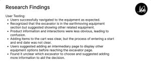
User Research: User interviews and surveys Asking users questions on what they currently didn’t like about the site and what would they do to improve their experience
Competitive Analysis:
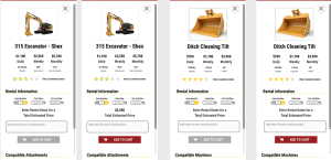
Sunbelt rentals has a pretty straightforward navigation system to find inventory and pick out their rental dates. Our design has a pretty similar and straightforward design like this site.
American Rental has many different options for renting but the navigation to rent out things and find attachments is a bit confusing. Our site is pretty straightforward so guest don’t have to worry about finding what they need.
screenshot 2025 11 20 at 10.01.52 pm 1
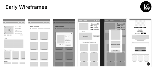
My team generated our ideas through “How might we” exercises, sketching, user flows, and more. For the user flows we thought what the most important steps would be when going through the process. The frames above are a couple different ideas for wireframes we had for different frames. For the colors and fonts we used, we had to go off of what Caterpillar provided us through their style guides.
Our final design helps users navigate to equipment and attachments without any issues. The overall design is clean and easy to use. The biggest challenge we faced when coming up with a design that is different from the original design but has the same goal. I learned from this assignment that working in a team is very helpful when designing but it also can be a little challenging when others have different ideas. If I were to continue to work on this project, I would work on making this site accessible for everyone, especially people who aren’t good with technology.
screenshot 2025 11 20 at 10.02.44 pm 1
Contact

Contact me to discuss your design needs. Let’s bring your ideas to life!